
Hello, I'm John Peele.
I am a product designer with a broad creative & technical skillset. I have over 27 years of experience helping teams create simple & elegant digital product experiences.
I believe in the power of design to solve human problems. More specifically, I specialize in design systems, user interface design, interaction design, and front-end development of digital products (mouthful).
Now
I am currently helping lead and grow the design system and team at MuleSoft. As a part of the Salesforce family of companies, I am surrounded by some of the best and brightest minds in the design system community. I really do love it here!
Background
Before arriving at MuleSoft, I helped ServiceNow's design systems and design operations teams architect their migration from Sketch to Figma.
And prior to a short contract with the awesome design team at MURAL, I was a UX Design Lead at Galvanize where I spent almost five years designing the HighBond product experience for governance, risk, and compliance professionals. My last year was focused on creating and managing the Starling Design System that supported the HighBond user interface.
Before entering the world of full-time employment, I led a team of 4 in my design consultancy - Good Citizen - for 15 years, conducting user research interviews, A/B testing concepts, leading design workshops, writing countless proposals, and delivering solutions for a wide range of challenges.
My working style
I like "just enough" structure, process, and systems. Rather than constrain, I believe they create freedom, effectiveness, and provide teams a safe environment in which they can experiment without consequence. I would consider myself a craftsman focused on accuracy and quality in my work, yet always striving to "find the right amount of perfect".
I like to work with a strategic plan, but will encourage down-to-earth realism and prefer to design interatively to achieve that vision. I will help the team to work more effectively. I have intensive problem-solving capabilities with a common-sense, practical approach.
I am at my best when working closely and truly collaborating with a cross-functional team, flying solo is not my idea of a good time. I love continuous and constructive feedback, even the tough stuff, as it pushes everyone to create their best work.
Personal
Outside the world of design, I am a competitive soccer player, health & fitness nut, and rabid Manchester United fan. I have called North Carolina home for my entire life and love exploring all its nooks-n-crannies with my wife Britten and children Brisyn and Saylor Grace.
Work
HighBond Robots
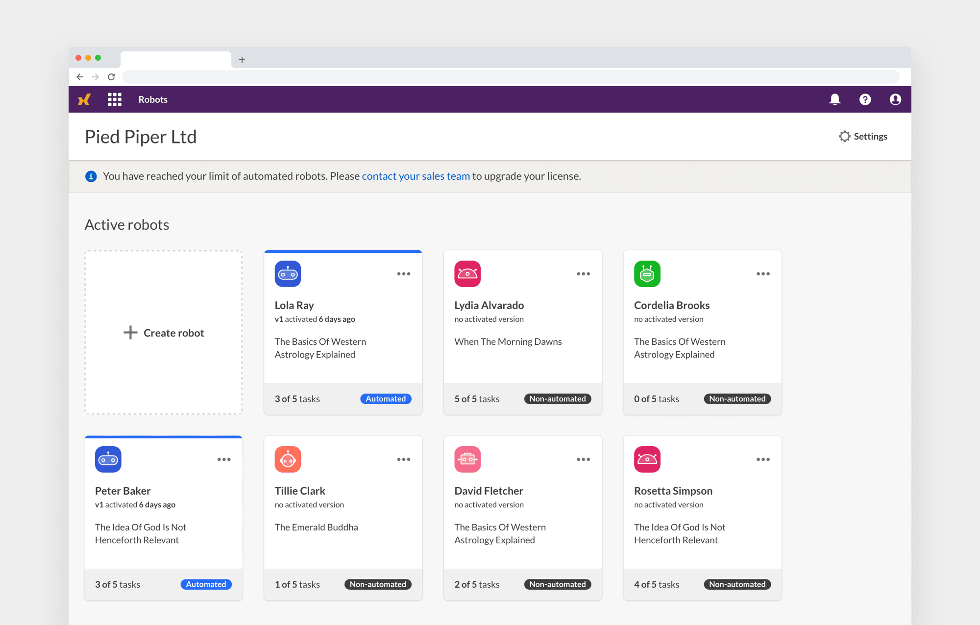
Easily the most challenging, and rewarding, work of my career. Robots was the first net-new product addition to the HighBond platform in over 3 years. It represented a monumental shift in our approach to automating and managing the scripting and analysis of client data — we needed to translate a desktop app experience to a fully cloud-based hosted platform that enabled our customers to automate their entire analytics lifecycle. This meant that numerous core users would be interacting with Galvanize in the cloud for the first time since becoming a customer.
The result was a product that opened new market segments, allowing customers to move from on-premise desktop installed software to a cloud-based serverless environment. I succeeded in replacing a code-based script-heavy experience with a visual interface that could be utilized by the most inexperienced of team members.
My work spanned across user interviews, flow diagrams, lo-fi wireframes, illustration, and high fidelity prototypes. I coordinated efforts with product managers, frontend developers, and the content team in weekly design syncs to ensure quality for the shipped product.
Note: NDA's prevent public sharing of detailed product information
- Scope Augment our on-prem analytics product with cloud-based automation
- Timeframe 2018-2019 / 18 months
- Role Lead UX & product designer
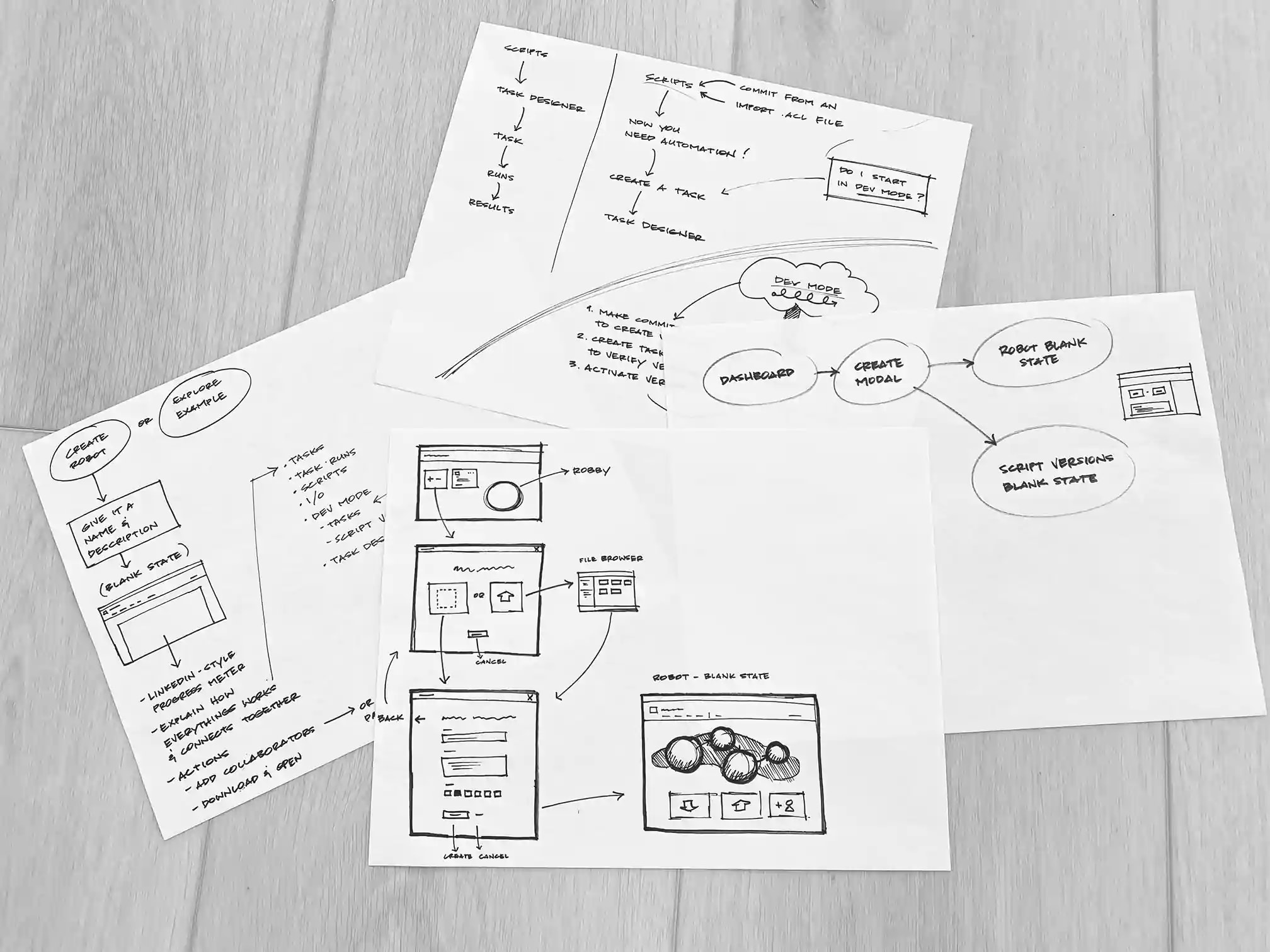
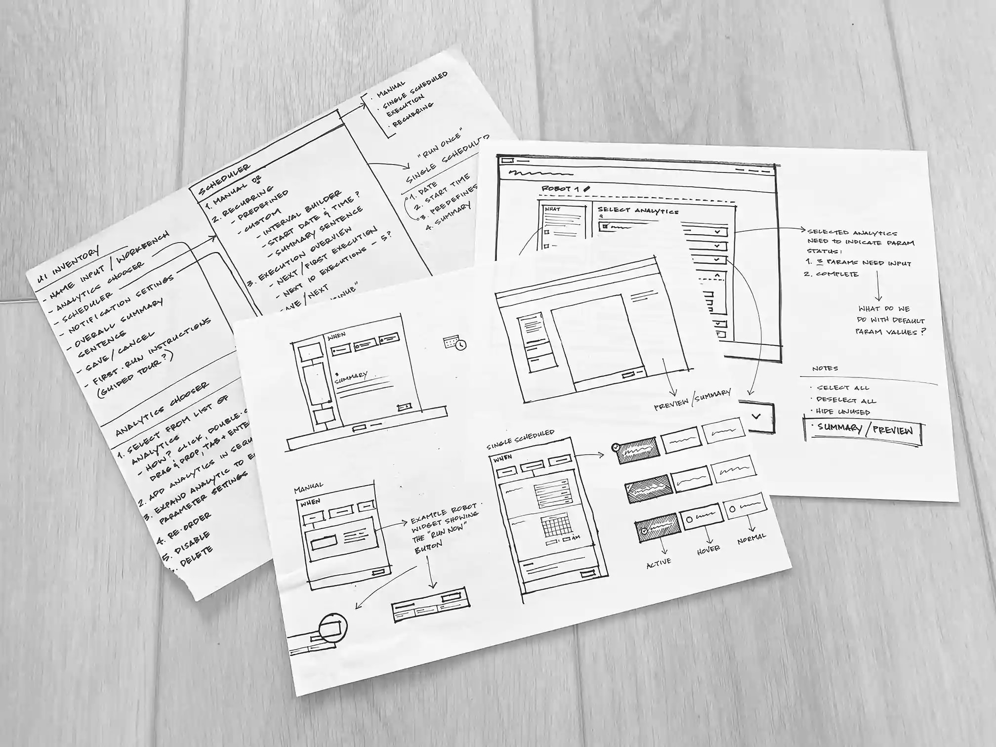
Everything begins with pen and paper
I love how writing and sketching helps me to focus on the problem at hand. Words, boxes, and arrows allow me to capture workflows early on and ensure that I don't lose sight of the forest due to the trees. And by trees I mean pixels, colors, fonts, Sketch, Figma, Framer, etc. Rushing for the nearest design tool almost always results in half-baked and less thoughtful concepts.
In the absence of experimentation and exploration, innovation is near impossible IMHO. My writing and sketching naturally evolves into UX solutions, UI sketches, and interaction flows that always produce better results than if I had skipped the process.
The Task Designer
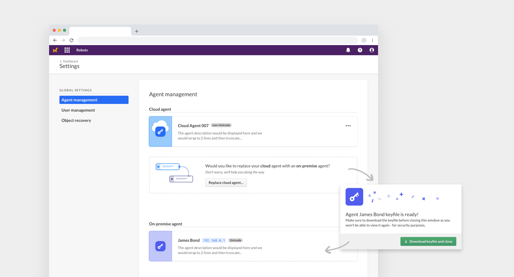
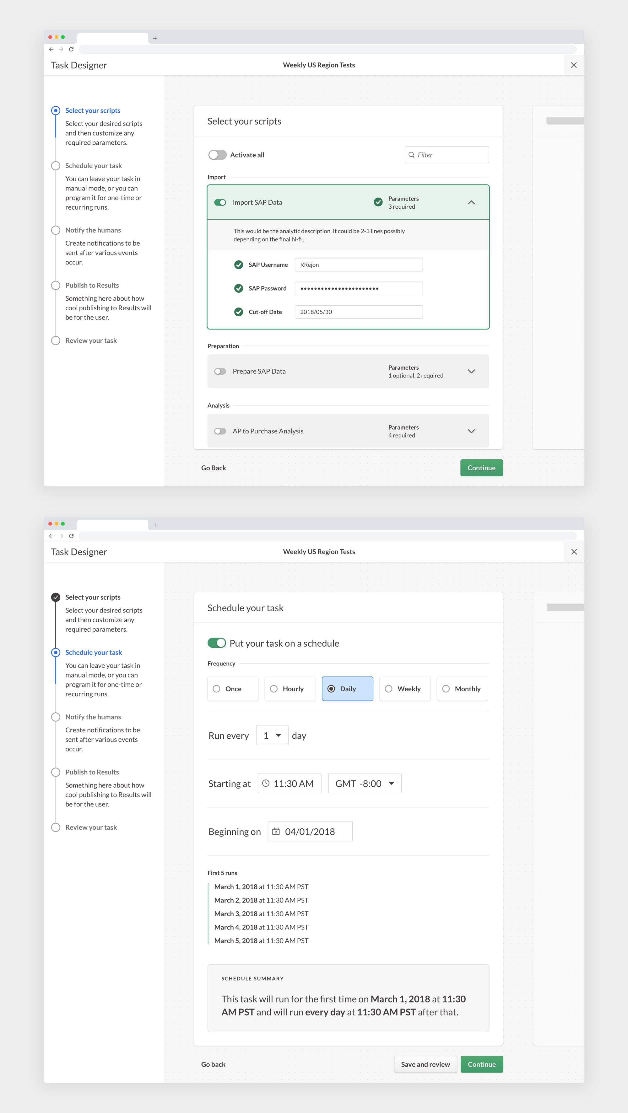
This Robots feature was basically a project within a project. The scope of the Task Designer was very ambitious, with the ability for a user to configure scripts, automate the execution of the task, send notifications to team members, and finally publish analysis results to a separate area of the HighBond platform.
Whew, I'm tired from just typing all that. Functionality and fat were trimmed in order for us to meet production deadlines, but the end result remained true to the original vision and goals.
A place for developers to call their own
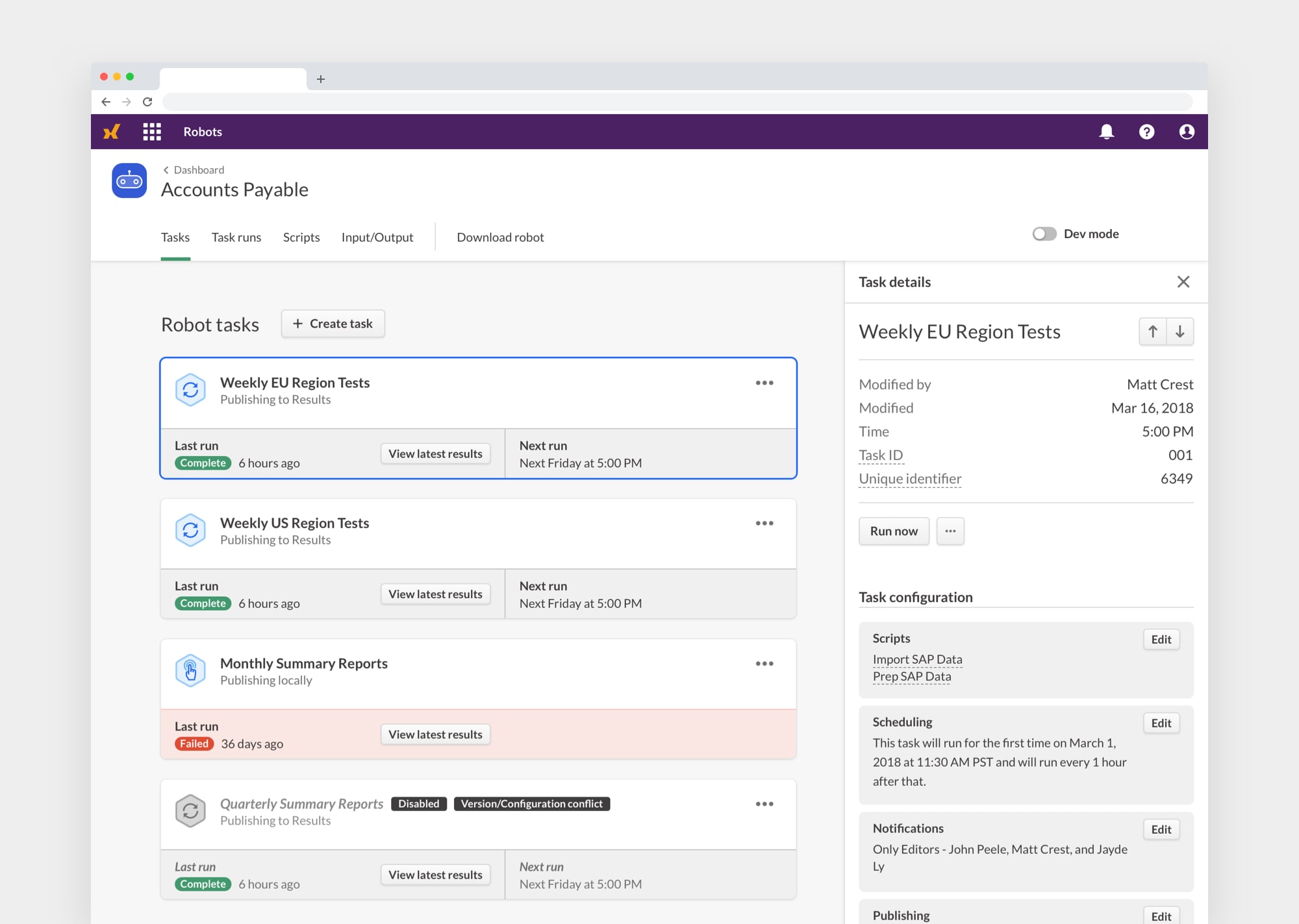
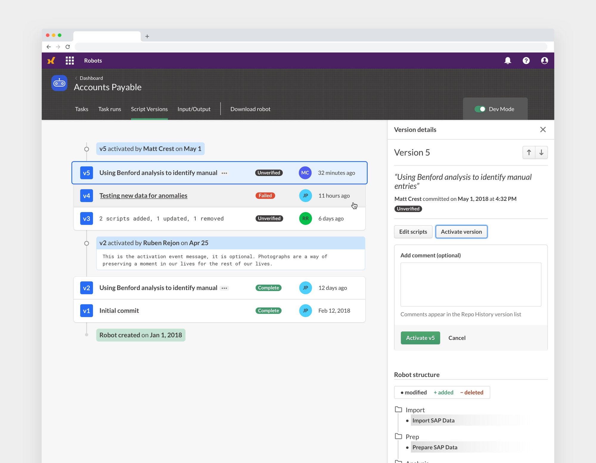
We knew that we wanted to keep things simple and clear for everyday users of Robots, but analysis script developers needed a bit more. Robot version control, file diffs, version activation and deactivation were some of the more involved needs for developers - Dev Mode to the rescue. A toggle switch allows a developer to enter into an tailored space to complete their work. Dev Mode is permission-based and access restricted to keep unintended consequences at bay.
Consistent ≠ boring
An ongoing goal for myself, and the entire UX design team, is consistency and low cognitive overhead for users. So we always strived to reuse UI components and patterns wherever possible to promote and ensure that consistent environment. This can lead to a lot of repetition and potential stagnation in the visual UI design of a platform.
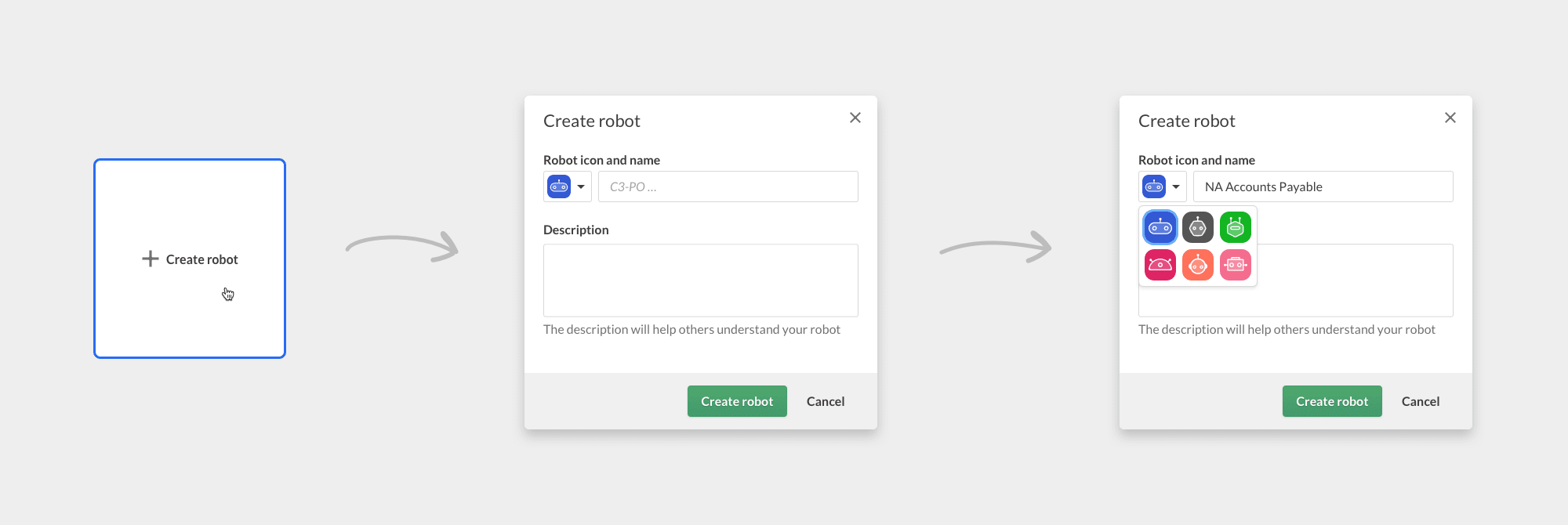
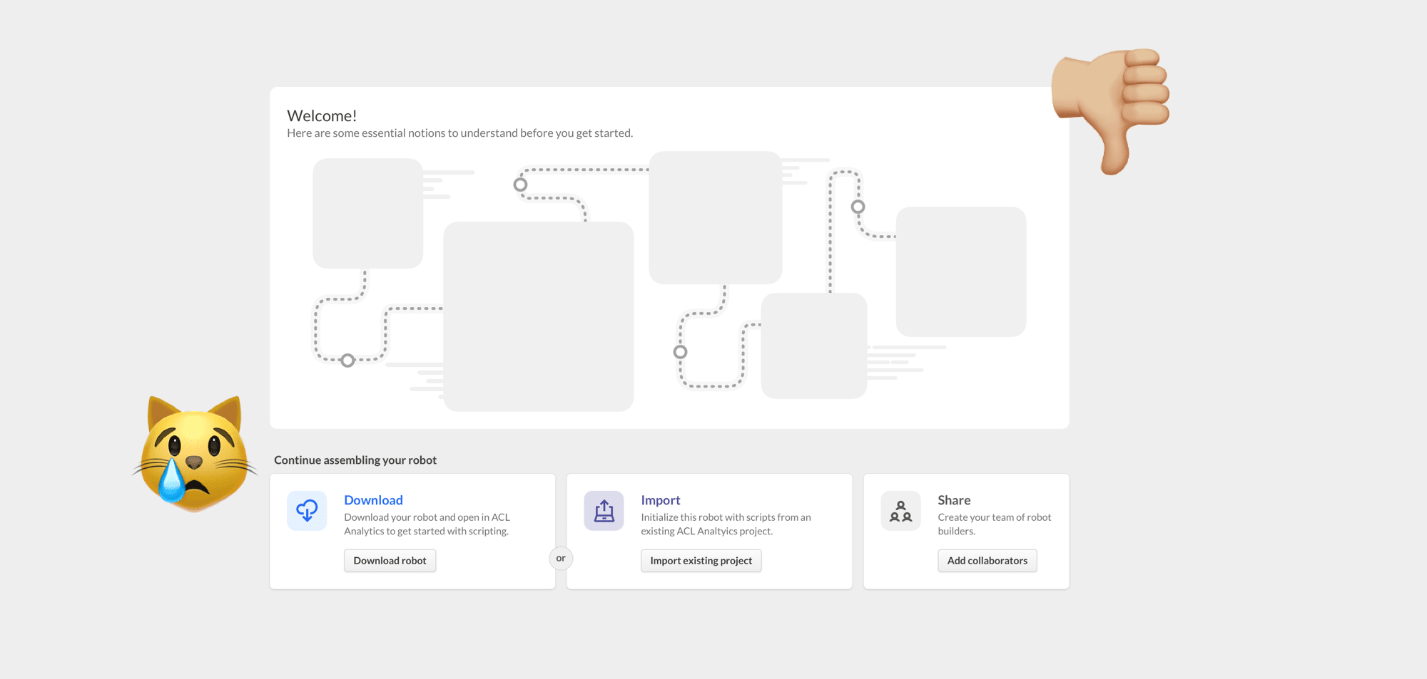
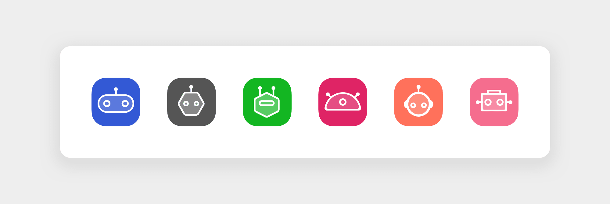
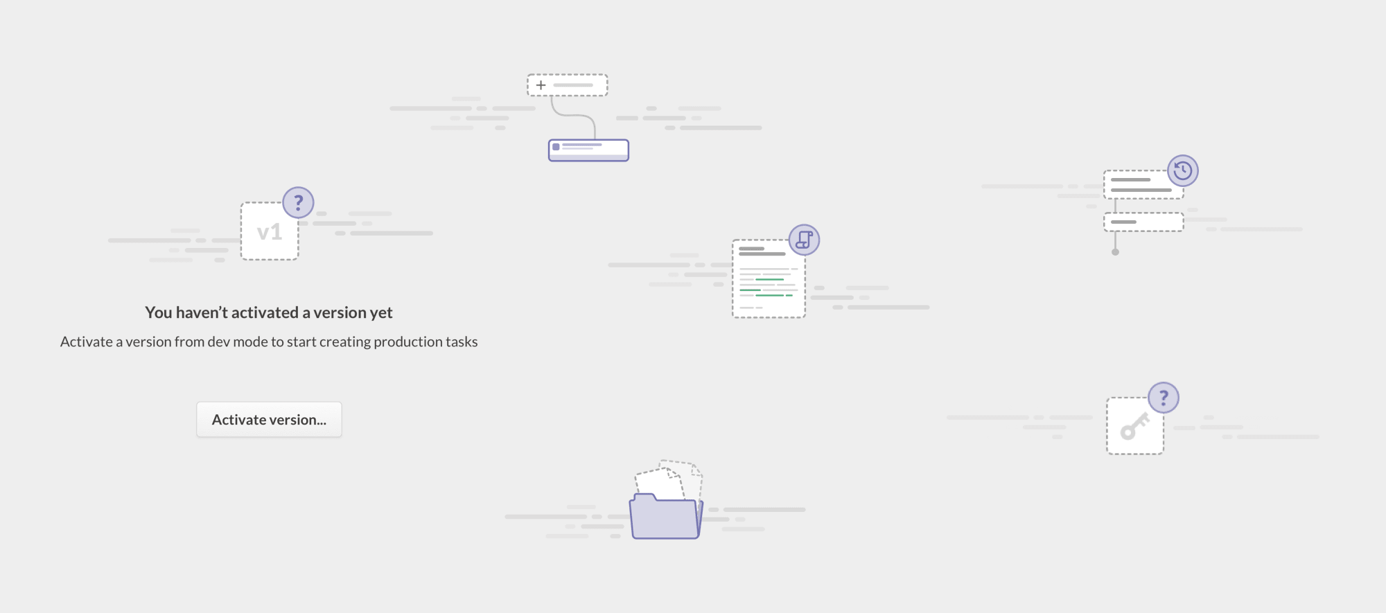
I always sought to balance predictable consistency with unexpected delight. I would look for ways to inject personality into my work. These robot icons and "empty state" illustrations are a prime example, and everyone really got a kick out of them.
Analytics Data Access

ACL Analytics is the flagship product that Galvanize (ACL) was built upon. It is a Windows desktop application with a semi-annual release cycle, which meant that margins for error and room for "way out there" experimentation were very thin.
The product manager had identified that we needed to provide users with a more friendly method for connecting to existing data sources and building queries for importing that data into our Analytics application. We designed the Analytics Data Access query builder to solve this problem and provide a point-and-click UI for connecting to a database and then constructing queries for data extraction and import.
User research and validation was kept to a minimum - the product manager had a firmer grasp on the user need from his days as a member of the customer support team. So I was able to jump right into diverging exploration through sketches, wireframes, and low-fidelity Balsamiq prototypes, which allowed us to focus on the most complex aspect of the application — the Query Builder.
- Scope Design an interface for accessing various databases and constructing queries for data import
- Timeframe2016-2017 / 6 months
- Role Lead UX & product designer

Connecting to a data source
The user's first step is to connect to their desired data source. The data source could be either an on-premise database or a cloud source. Users were still very familiar with old-school FTP and DSN connection techniques, so this informed our final solution for the connection parameter dialogs.


Give them the power
We certainly did not wish to hamstring our more experienced and knowledgeable users. So we designed a power mode where the visual query builder would be hidden in favor of a text editor-ish area where raw SQL could be written by those who preferred the control they were used to. Toggling from SQL mode back to the visual builder would erase the query. This was a trade-off that was made due to the complexity of 2-way translation of SQL commands.

Analytic Header Designer
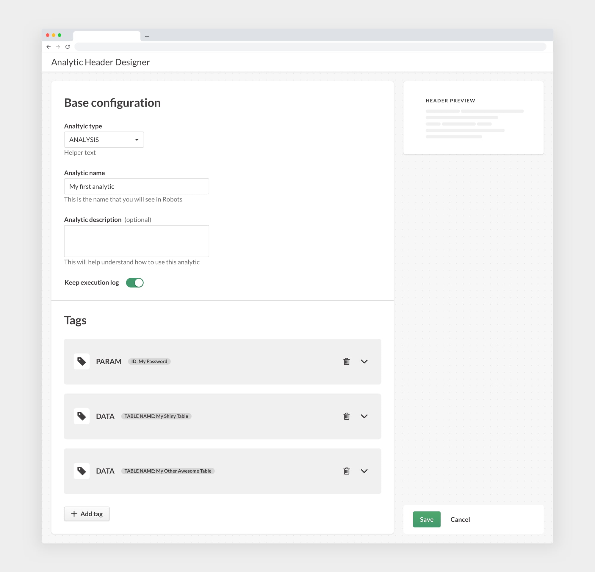
Content team is on furlough. Project overview coming soon...
- Scope Create a simple visual interface for our complex developer-focused scripting environment
- Timeframe 2019 / 3 months
- Role Lead UX & product designer

Starling Design System

The Starling Design System (SDS) turned out to be both my passion project and my last contribution to the Galvanize organization. I poured all my energy and focus into establishing the first version of our design system and was well on the way to the next major revision through numerous iterations and improvements. The core design system team learned what worked well and what didn't through hands-on use and evangelism of the system to the product teams and developers who used the components and patterns to speed up their workflows.
The SDS is a combination of reusable design components in Figma, coded React components, and design guidelines & best practices that directed the use of the system. Design foundations were established for typography, color, and spacing/layout. These foundations were the building blocks of the design components which were then codified via React.
You can visit the public design guidelines site, of which I also led the design efforts, and see some of the results for yourself.
- Scope Create, maintain, and evangelize system of design guidelines, components, and patterns
- Timeframe 2017-present
- Role Lead UI designer and maintainer

You did it, you made it to the end!
If you want to learn more or think I could help you in any way, please contact me
Have a nice day!
Note
I am rebuilding this site live and in the open. Follow along as things progress, and you can always view the old version of the Good Citizen site.